Rebranding the Brand:
Becoming The Passive House Network
PHN was founded in 2011 as an informal network of regional Passive House organizations from across the US as the American Passive House Network (APHN), in support of global Passive House cooperation. We then quickly grew to include Passive House groups across Canada as well, and so the name morphed into the North American Passive House Network (NAPHN) – establishing itself formally as a cooperative corporation consisting of independent organizations from Maine to British Columbia.
By 2018, NAPHN had become a 501c3 nonprofit organization with a focus on the United States, as Passive House Canada was earlier established out of CanPHIWest, as a national organization. Consequently, there was a growing feeling that the organization’s name and branding should be updated to reflect the new reality.
Finally, in 2020, Edie Dillman and Karen Spiegel joined the Board of Directors and Ken Levenson became the new Executive director, all in support of working on a rebranding effort – and so it was decided, with the leadership of Board Chair Bronwyn Barry, to embark on the process of rebranding.
The Process
After an extensive search and collection of proposals, we were very happy to hire MASS Design Group, an international design and architecture firm committed to sustainability and equity, with a history of making distinctive and impactful branding for clients.
Everything was on the table – the name, the colors, the feel. And while there was a fondness for the NAPHN brand it was agreed that it was a mouthful and was anachronistic with the current national focus.
So over several months, we entered an intensive process with MASS – completing a community survey with input from a variety of stakeholders, diving into concepts and brand research with hundreds of names considered and rounds of logos, colors, and other aspects considered.
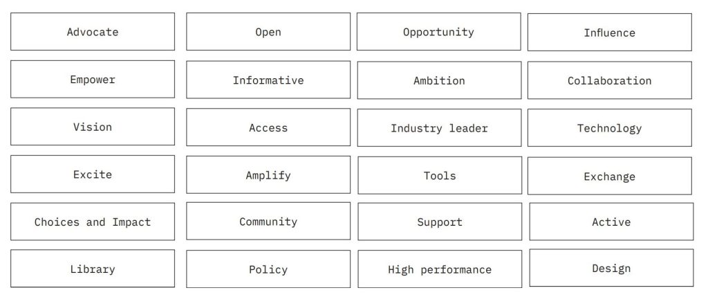
It was an interesting process asking penetrating questions: How were we perceived? What were our desired attributes? What are our desired brand qualities? How can branding embody the spirit of our organization and community? Tough choices had to be made, ideas condensed, things edited and simplified.
We had fun thinking about how we should be pushing forward, with aspirations including:
- Accessible, engaging, informative language
- Bold, audacious, fresh perspective
- Inspirational “sticky”, savvy
- Disrupt misconceptions
- Break down barriers to learning
- Make a welcoming & equitable space for members
Aspirational brand qualities were boiled down to the priorities of:
- Simple & Clean
- Accessible & Transparent
- Committed & Mission-Focused
- Bold
The voice and messaging was considered:
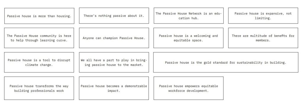
As well as the voice and language:
The Name
So for the name, we really looked hard at lots of names from an unimaginable range of obvious and made up words to simple and attenuated expressions – like ActivePassive to Solidus. It boggled the mind. Admittedly, it was hard to move away from the word “network”, as it captured the essence of our core activity of connecting. And it was thought that we might keep things simple – we’re all about Passive House. We not only couldn’t move from “Passive House” – we wanted to celebrate it. Then, reverting to our original name, the American Passive House Network was always an option, of course, but “American” seemed unnecessary. Consequently, The Passive House Network was realized. It is simple, relatively compact, and versatile. A timid choice? We’d say it was a smart one and could be bold.
Don’t let “The” throw you. For a simple reference for usage, think of the constructions for The New York Times – we all use The Times in a number of ways without thinking about it…just run it through your mind and you’ll have the answers.
The Logo Mark
Fonts, color and photography came into play, (so many considerations!) visually translating the voice, but looming over all was the logo, the mark, of course. Here we bow to Joelle Riffle, the lead designer on the project at MASS, and someone with patience, insight and the ability to transform often seemingly contradictory feedback into what is undoubtedly an iconic logo.
Like great art you can take away many readings from the logo but its presence is the thing. It folds, it slips, and it twirls. It bounces and glides but stands firm. It wants to be completed but is complete. It’s in balance, yet is asymmetrical. It’s cursive. It’s action. It’s compact and expansive. Yes, the red curve forms the P in Passive and the blue curve the H in House – each delicately anchored to the vertical, nearly black, connecting stitch. And then let’s see the red and blue as the hot and cold separated by airtightness or perhaps the heat exchange of the ventilation system. Monochromatic in white, black or another color, it’s a taught yet dynamic monolith. There are no wrong answers – see what you like.
![]()
![]()
The Rollout
We started the branding process at the end of 2020, with a soft roll-out in the Fall of 2021. We look forward to building on the work so far, extending the thinking – which is informed by our work and informs our work – helping push ourselves and our community forward.
We look forward to pushing forward with you.